3.2.4. Curve Plot
The Curve plot, shown in Figure 3.16, displays a simple group of X-Y pair data such as that output by 1D simulations or data produced by Lineouts of 2D or 3D datasets. Curve plots are useful for visualizations where it is useful to plot 1D quantities that evolve over time.
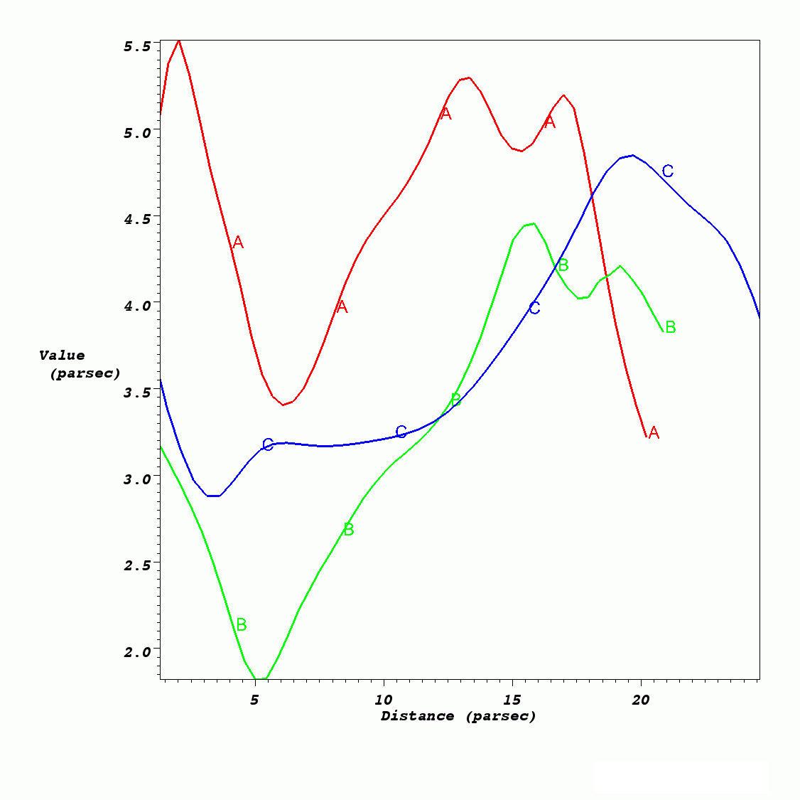
Fig. 3.16 Curve plot
3.2.4.1. Setting curve color
The Curve plot’s color is set up to Cycle by default. In other words, each new curve created will be a different color. This can be turned off by selecting the Custom radio button, and a new color can be chosen by clicking on the Color button and making a selection from the Popup color menu.
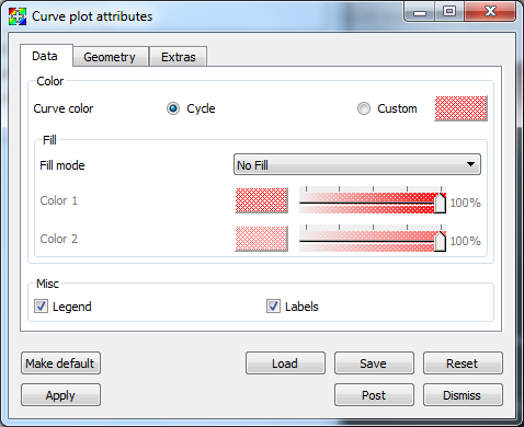
Fig. 3.17 Curve plot attributes, data tab
3.2.4.2. Showing curve labels
Curve plots have a label that can be displayed to help distinguish one Curve plot from other Curve plots. Curve plot labels are on by default, but if you want to turn the label off, you can uncheck the Labels check box.
3.2.4.3. Space-filled curves
The space below a curve can be filled with color by changing Fill mode to either Solid, Horizontal Gradient or Vertical Gradient, then choosing one or two colors based upon the mode chosen.
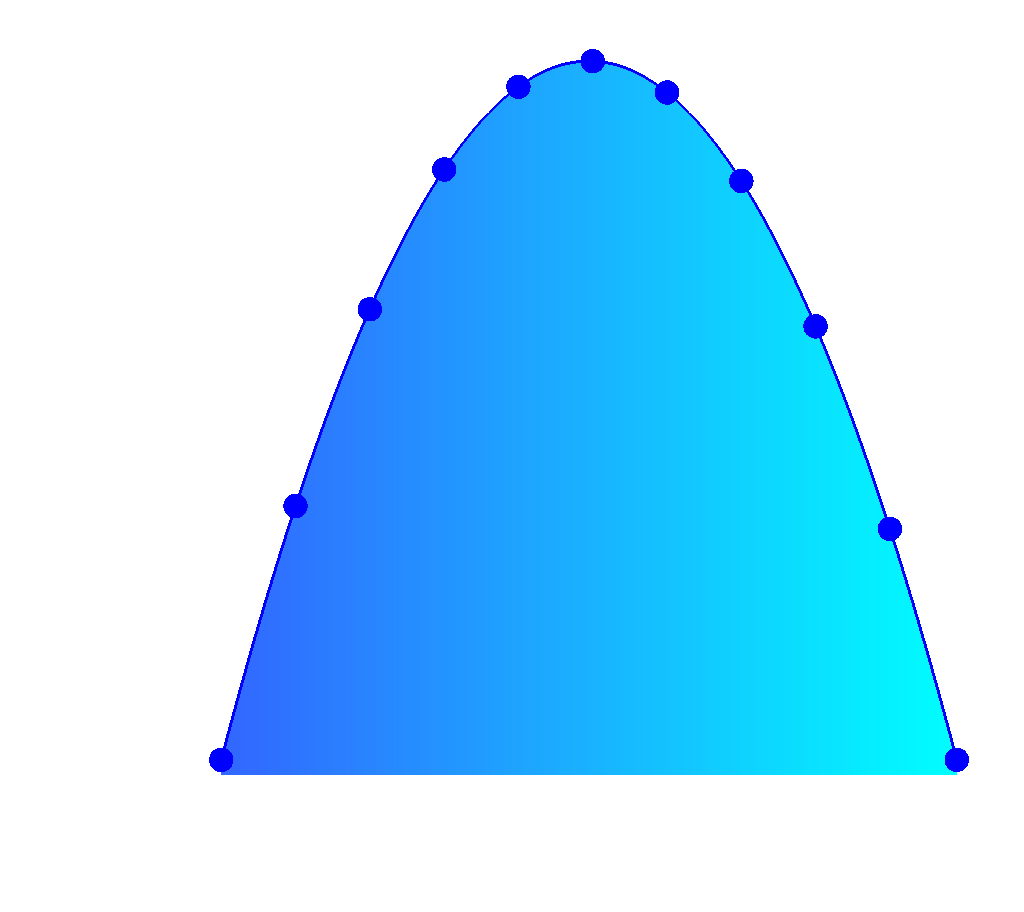
Fig. 3.18 Curve, space-filled with points
3.2.4.4. Setting line style and line width
Several Curve plots are often drawn in the same visualization window so it is necessary that Curve plots can be distinguished from each other. Fortunately, VisIt provides controls to change the line style and line width so that Curve plots can be told apart. Line style is a pattern used to draw the line and it is solid by default but it can also be dashed, dotted, or dash-dotted. You choose a new line style by making a selection from the Line Style combo box on the Geometry tab (see Figure 3.19). The line width, which determines the boldness of the curve, is set by making a selection from the Line Width combo box.
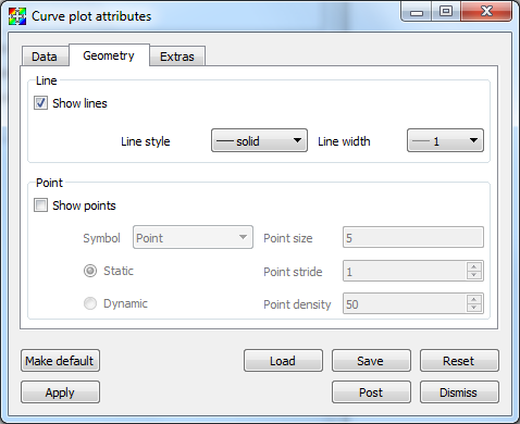
Fig. 3.19 Curve plot attributes, geometry tab
3.2.4.5. Drawing points on the Curve plot
The Curve plot is composed of a set of (X,Y) pairs through which line segments are drawn to form a curve. To make VisIt draw a point glyph at the location of each (X,Y) point, click the Show points check box on the Geometry tab. You can control the size of the points by typing a new point size into the Point size text field. You can choose the type of symbol used to represent the points by using the Symbol combo box.
The number of points drawn can be controlled by the Static or Dynamic radio buttons. For Static mode, points are drawn at regular intervals controlled by the value of the Point stride text box. For Dynamic mode, the number of points drawn is view-dependent, with density controlled by the Point density text box.
3.2.4.6. Adding Time Cues
Time cues are most often used in conjunction with movie making. They allow for markers to be placed at certain positions along a curve, and/or for the curve to be cropped at the specified position. Time cues make it easier to see the current time position along a curve. Though most often created and controlled via scripting, the Extras tab in the Curve attributes window can also be used (see Figure 3.20). There are two types of markers: Ball and Line. They are controlled by the Add Ball and Add Line check boxes. They have separate color and size controls. To crop the line, select the Crop check box. The Position of cue text box controls the location along the curve where the ball and line are placed and where the cropped curve ends. Figure 3.21 shows examples of curves created using different time cue settings.
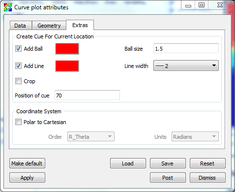
Fig. 3.20 Curve plot attributes, extras tab
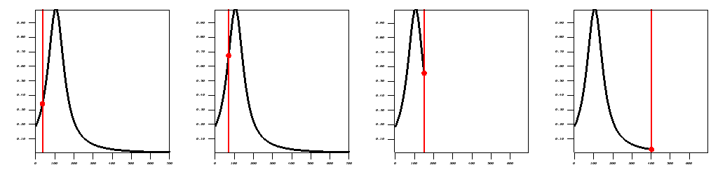
Fig. 3.21 Curve plot with time cues added at different positions, both uncropped and cropped.
3.2.4.7. Polar coordinate system conversion
If the curve data is in Polar instead of Cartesian coordinates, you can tell VisIt to convert by selecting the Polar to Cartesian option on the Extras tab. You can choose the Order to be R_Theta or Theta_R and choose Radians or Degrees for the Units. Figure 3.22 shows an example.
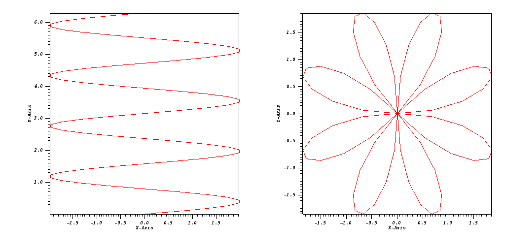
Fig. 3.22 Curve plot before and after Polar coordinate transform (R-theta, radians)