3.2.5. Histogram Plot
The Histogram plot divides the data range of a scalar variable into a number of bins and groups the variable’s values into different bins. The values can be based on frequency, they can be weighed by the area/volume of the cells, or they can be weighed by a variable. The values in each bin are then used to create a bar graph or curve that represents the distribution of values throughout the variable’s data range. The Histogram plot can be used to determine where data values cluster in the range of a scalar variable. The Histogram plot is shown in Figure 3.23.
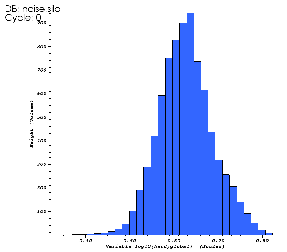
Fig. 3.23 Histogram plot
3.2.5.1. Setting the histogram data range
By default, the Histogram plot profiles a variables entire data range. If you want to restrict the Histogram plot so it only takes a subset of a variable’s data range into consideration when assigning values to bins, you can set the minimum and maximum values that will be considered by the Histogram plot. To specify a data range, click the Minimum and/or Maximum check box and then type in floating point numeric values into the Minimum and Maximum text fields in the Histogram plot attributes window (see Figure 3.24) before clicking the Apply button. Once the data range is set, the Histogram plot will restrict the values that it considers to the specified data range.
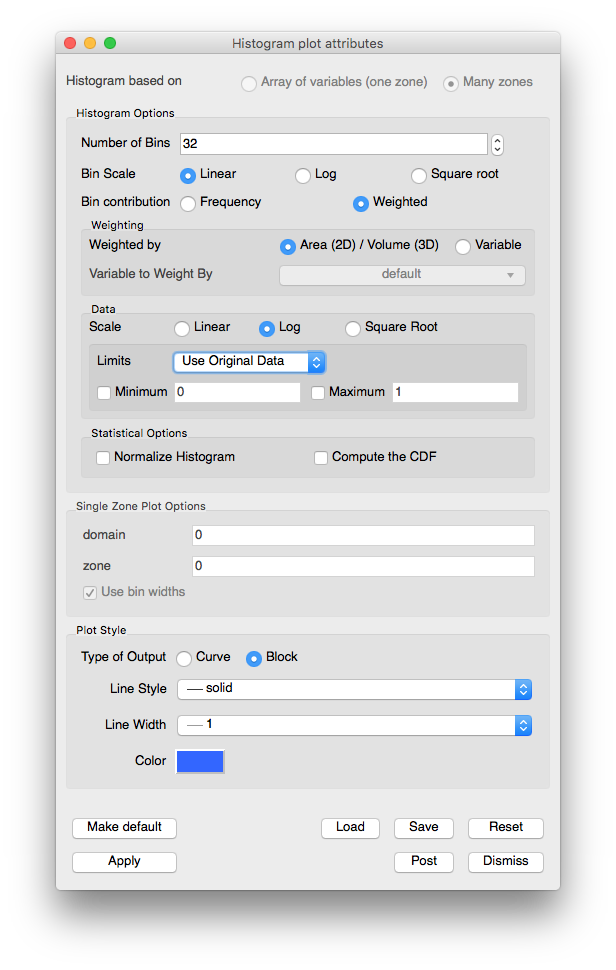
Fig. 3.24 Histogram attributes
3.2.5.2. Setting the type of graph
The Histogram plot has two mode in which it can appear: curve and block. When the Histogram plot is drawn as a curve, it looks like the Curve plot. When the Histogram plot is drawn in block mode, it is drawn as a bar graph where each bin is plotted along the X-axis and the height of each bar corresponds to the number of values that were assigned to that bin. You can set change the Histogram plot’s appearance by clicking the Curve or Block radio buttons.
3.2.5.3. Setting the number of bins
The Histogram plot divides a variable’s data range into a number of bins and then counts the values that fall within each bin. The bins and the counted data are then used to create a graph that represents the distribution of data within the variable’s data range. As the Histogram plot uses more bins, the graph of data distribution becomes more accurate. However, the graph can also become rougher because as the number of bins increases, the likelihood that no data values fall within a particular bin also increases. To set the number of bins for the Histogram plot, type a new number of bins into the Number of Bins text field and click the Apply button in the Histogram plot attributes window.
3.2.5.4. Setting the histogram calculation method
The data values can be based on frequency, they can be weighed by the area/volume of the cells, or they can be weighed by a variable. By default, Frequency is selected under bin contribution. Selecting Weighted will enable the Weighting options, from which one can select Area (2D) / Volume (3D) or Variable to determine the type of weighing.
3.2.5.5. Data scaling
There are three radio buttons that controls how the data values are scaled. The three options are:
Linear: no scaling is applied. This is the default option.
Log: the logarithms of all the scalars are binned.
Square Root: the square roots of all scalars are binned.
3.2.5.6. Statistical Options
The Histogram binning results can be processed further to calculate statistical distributions. The Statistical Options controls support this:
Normalize Histogram: Will bin the data and then divide each bin by the sum of the values across all bins, to create a Probability density function.
Compute the CDF: Will bin the data, normalize it, and then create a Cumulative distribution function from the normalized binning.