4. Aneurysm
This tutorial provides a short introduction to VisIt’s features while exploring a finite element blood flow simulation of an aneurysm. The simulation was run using the LifeV finite element solver and made available for this tutorial thanks to Gilles Fourestey and Jean Favre, Swiss National Supercomputing Centre.
4.1. Open the dataset
This tutorial uses the aneurysm dataset.
Download the aneurysm dataset.
Click on the Open icon to bring up the File open window.
Navigate your file system to the folder containing “aneurysm.visit”.
Highlight the file “aneurysm.visit” and then click OK.
4.2. Plotting the mesh topology
First we will examine the finite element mesh used in the blood flow simulation.
4.2.1. Create a Mesh plot
Go to Add->Mesh->Mesh.
Click Draw.
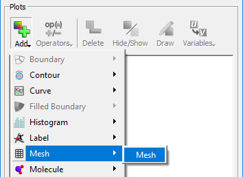
Fig. 4.92 Adding a mesh plot.
After this, the mesh plot is rendered in VisIt’s Viewer window. Modify the view by rotating and zooming in the viewer window.
4.2.2. Modify the Mesh plot settings
Double click on the Mesh plot to open the Mesh plot attributes window.
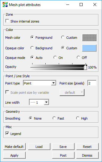
Fig. 4.93 The mesh plot attributes window.
Experiment with settings for:
Mesh color
Opaque color
Opaque mode - When the Mesh plot’s opaque mode is set to automatic, the Mesh plot will be drawn in opaque mode unless it is forced to share the visualization window with other plots, at which point the Mesh plot is drawn in wireframe mode. When the Mesh plot is drawn in wireframe mode, only the edges of each externally visible cell face are drawn, which prevents the Mesh plot from interfering with the appearance of other plots. In addition to having an automatic opaque mode, the Mesh plot can be forced to be drawn in opaque mode or wireframe mode by selecting the On or Off. This is best demonstrated with the Pseudocolor plot of pressure present.
Show internal zones
You will need to click Apply to commit the settings to your plot.
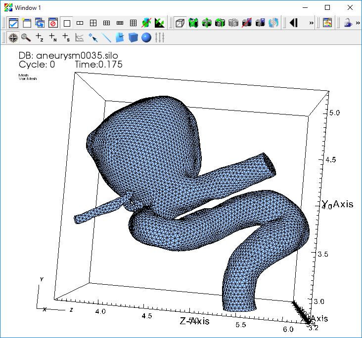
Fig. 4.94 The mesh plot of the aneurysm.
4.2.3. Query the mesh properties
VisIt’s Query interface provides several quantitative data summarization operations. We will use the query interface to learn some basic information about the simulation mesh.
Go to Controls->Query to bring up the Query window.
Select NumZones and click Query.
This returns the number of elements in the mesh.
Select NumNodes and click Query.
This returns the number of vertices in the mesh
Note: The terms “zones”, “elements”, and “cells” are overloaded in scientific visualization, as are the terms “nodes”, “points”, and “vertices”.
4.2.4. Additional exercises
What type of finite element was used to construct the mesh?
How many elements are used to construct the mesh?
How many vertices are used to construct the mesh?
On average, how many vertices are shared per element?
4.3. Examining scalar fields
In addition to the mesh topology, this dataset provides two mesh fields:
A scalar field “pressure”, associated with the mesh vertices.
A vector field “velocity”, associated with the mesh vertices.
VisIt automatically defines an expression that allows us to use the magnitude of the “velocity” vector field as a scalar field on the mesh. The result of the expression is a new field named “velocity_magnitude”.
We will use Pseudocolor plots to examine the “pressure” and “velocity_magnitude” fields.
Go to Add->Pseudocolor->Pressure.
Click Draw.
Double click on the Pseudocolor plot to bring up the Pseudocolor plot attributes window.
Change the color table to Spectral and check the Invert button.
Click Apply.
Click Draw.
Click Play in the Time animation controls above the plot list on the main GUI window.
You will see the pressure field animate on the exterior of the mesh as the simulation evolves.
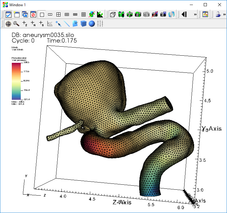
Fig. 4.95 The pseudocolor plot of the pressure.
Experiment with:
Setting the Pseudocolor plot limits.
Hiding and showing the Mesh plot.
When you are done experimenting, stop animating over timesteps using the Stop button.
4.3.1. Query the maximum pressure over time
We can use the “pressure” field to extract the heart beat signal. We want to find the maximum pressure value across the mesh elements at each timestep of our dataset. VisIt provides a Query over time mechanism that allows us to extract this data.
First, we need to set our query options to use timestep as the independent variable for our query.
Go to Controls->Query over time options.
Select Timestep.
Click Apply and Dismiss.
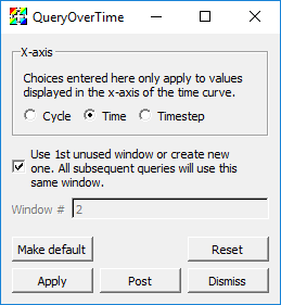
Fig. 4.96 The QueryOverTime attributes window.
Now we can execute the Max query on all of our timesteps and collect the results into a curve.
Click on the Pseudocolor plot to make sure it is active.
Go to Controls->Query to bring up the Query window.
Select Max.
Check Do Time Query.
Click Query.
This will process the simulation output files and create a new window with a curve that contains the maximum pressure value at each time.
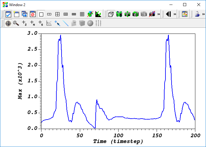
Fig. 4.97 The query over time plot.
4.3.2. Additional exercises
How many heart beats does this dataset cover?
Estimate the number of beats per minute of the simulated heart (each cycle is 0.005 seconds).
4.4. Contours and sub-volumes of high velocity
4.4.1. Examining the velocity magnitude
Next we create a Pseudocolor plot to look at the magnitude of the “velocity” vector field.
Delete all your existing plots by selecting them all and clicking Delete.
Go to Add->Pseudocolor->velocity_magnitude.
Open the Pseudocolor plot attributes window and set the color table options as before.
Click Draw.
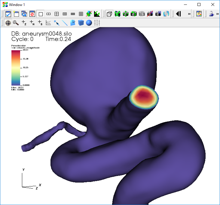
Fig. 4.98 The pseudocolor plot of the velocity magnitude.
Notice that the velocity at the surface of the mesh is zero. To get a better understanding of the flow inside the mesh, we will use operators to extract regions of high blood flow.
4.4.1.1. Creating a semi-transparent exterior mesh plot
When looking at features inside the mesh, it helps to have a partially transparent view of the whole mesh boundary for reference. We will add a Subset plot to create this view of the mesh boundary.
Uncheck Apply operators to all plots.
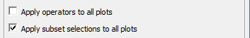
Fig. 4.99 The apply operators to all plots setting.
Go to Add->Subset->Mesh.
Open the Subset plot attributes window.
Change the color to Light Blue.
Set the Opacity slider to 25%.
Click Apply.
Click Draw.
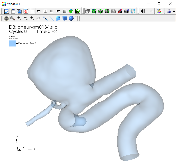
Fig. 4.100 The transparent subset plot.
4.4.1.2. Contours of high velocity
Now we will extract contour surfaces at high velocity values using the Isosurface operator.
Select the Pseudocolor plot in the plot list.
Go to Operators->Slicing->Isosurface.
Open the Isosurface operator attributes window.
Set Select by to Value, and use “10 15 20”.
Click Apply and Dismiss.
Click Draw and press the Play button to animate the plot over time.
You will see the contour surfaces extracted from the “velocity_magnitude” field animate as the simulation evolves.
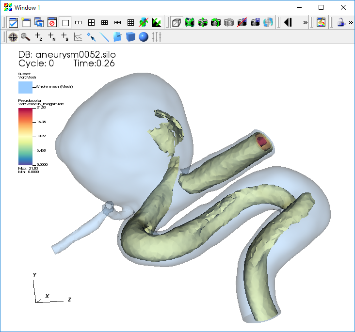
Fig. 4.101 The transparent subset plot with iso surfaces of velocity magnitude.
4.4.1.3. Sub-volumes of high velocity
As an alternative to contours, we can also extract the sub-volume between two scalar values using the Isovolume operator.
Click Stop to stop the animation.
Remove the Isosurface operator.
Go to Operators->Selection->Isovolume.
Open the Isovolume operator attributes window.
Set the Lower bound to “10” and the Upper bound to “20”.
Click Apply and Dismiss.
Click Draw and press the Play button to animate the plot over time.
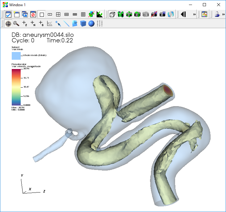
Fig. 4.102 The transparent subset plot with an iso volume of velocity magnitude.
4.5. Visualizing the velocity vector field
This section of the tutorial outlines using glyphs, streamlines, and pathlines to visualize the velocity vector field from the simulation.
4.5.1. Plotting the vector field directly with glyphs
VisIt’s Vector plot renders a vector field at each timestep as a collection of arrow glyphs. This allows us to see the direction of the vectors as well as their magnitude. We will create a vector plot to directly view the simulated “velocity” vector field.
Go to Add->Vector->velocity.
Open the Vector plot attributes window.
Go to the Sampling tab.
Set Stride to “5”.
Go to the Color section on the Data tab.
Change the Magnitude to Spectral, and check the Invert option.
Go to the Geometry tab.
In the Scale section, set the Scale to “0.5”.
In the Style section, set Arrow body to Cylinder.
In the Rendering section, set Geometry Quality to High.
Click Apply and Dismiss.
Click Draw.
Click Play.
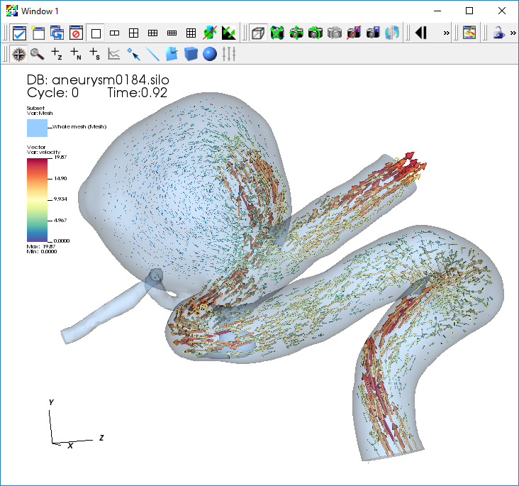
Fig. 4.103 The vector plot of velocity.
4.5.2. Examining features of the flow field with streamlines
To explore the flow field further we will seed and advect a set of streamlines near the inflow of the artery. Streamlines show the path massless tracer particles would take if advected by a static vector field. To construct Streamlines, the first step is selecting a set of spatial locations that can serve as the initial seed points.
We want to center our seed points around the peak velocity value on a slice near the inflow of the artery. To find this location, we query a sliced pseudocolor plot of the “velocity_magnitude”.
Go to Add->Pseudocolor->velocity_magnitude.
Open the Pseudocolor plot attributes window and set the color table options as before.
Go to Operators->Slicing->Slice.
Open the Slice operator attributes window.
In the Normal section set Orthogonal to Y Axis.
In the Origin section select Point and set the value to “3 3 3”.
In the Up Axis section uncheck Project to 2D.
Click Apply and Dismiss.
Click Draw.
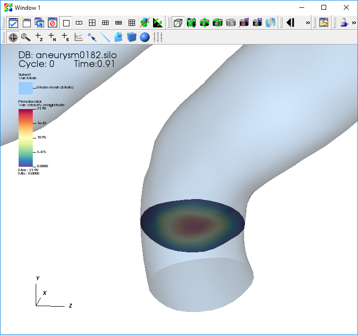
Fig. 4.104 The velocity magnitude on a slice.
4.5.2.1. Query to find the maximum velocity on the slice
Click to make sure the Pseudocolor plot of your “velocity_magnitude” slice is active.
Go to Controls->Query.
Select Max.
Select Actual Data.
Click Query.
This will give you the maximum scalar value on the slice and the x,y,z coordinates of the node associated with this value. We will use the x,y,z coordinates of this node to seed a set of streamlines.
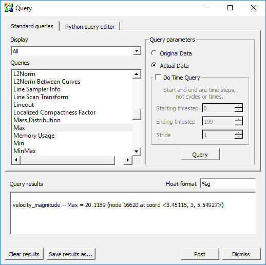
Fig. 4.105 The result of the velocity magnitude query.
4.5.2.2. Plotting streamlines of velocity
Go to Add->Pseudocolor->operators->IntegralCurve->velocity.
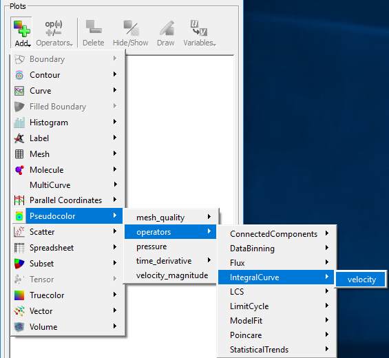
Fig. 4.106 Creating a streamline plot with the IntegralCurve operator.
Open the IntegralCurve operator attributes window.
Go to the Source section on the Integration tab.
Set the Source type to Circle.
Set the Origin to the value returned from the max query: “3.45115 3 5.54927”, excluding any commas in the input text box.
Set the Normal to the y-axis: “0 1 0”.
Set the Up axis to the z-axis: “0 0 1”.
Set the Radius to “0.12”.
Go to the Sampling section.
Set Sampling along: to Boundary.
Set Samples in Theta: to “12”.
Go to the Advanced tab.
In the Warnings section, uncheck all of the warning checkboxes.
Click Apply and Dismiss.
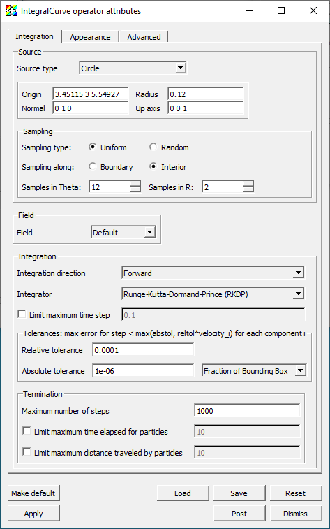
Fig. 4.107 The IntegralCurve operator attributes.
Open the Pseudocolor plot attributes window.
Go to the Data tab.
In the Color section set the Color table to Reds.
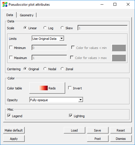
Fig. 4.108 The Pseudocolor attributes for the streamline data.
Go to the Line section on the Geometry tab.
Set Line type to Tubes.
Set Tail to Sphere.
Set Head to Cone.
Set the head and tail Radius to “0.03”.
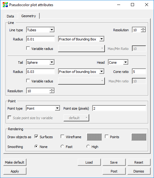
Fig. 4.109 The Pseudocolor attributes for the streamline geometry.
Click Apply and Dismiss.
Click Draw.
Use the time slider controls to view a few timesteps.
Fig. 4.110 The streamlines of velocity.
4.5.3. Examining features of the flow field with pathlines
Finally, to explore the time varying behavior of the flow field we will use pathlines. Pathlines show the path massless tracer particles would take if advected by the vector field at each timestep of the simulation.
We will modify our previous IntergralCurve options to create pathlines.
Set the time slider controls to the first timestep.
Open the IntegralCurve attributes window.
Go to the Appearance tab.
In the Streamlines vs Pathlines section select Pathline.
In the Pathlines Options section set How to perform interpolation over time to Mesh is static over time.
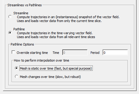
Fig. 4.111 The IntegralCurve operator pathline attributes.
Click Apply and Dismiss.
This will process all 200 files in the dataset and construct the pathlines that originate at our seed points.
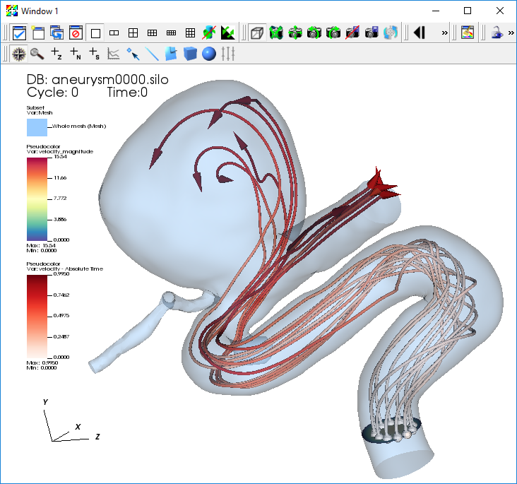
Fig. 4.112 The pathlines of velocity.
4.6. Calculating the flux of a velocity field through a surface
To calculate a flux, we will need the original velocity vector, the normal vector of the surface, and VisIt’s Flux Operator. We will calculate the flux through a cross-slice located at Y=3, at the beginning of the artery.
4.6.1. Creating the slice and showing velocity glyphs
First we will directly plot the velocity vectors that exist on the slice through the 3D mesh.
Delete any existing plots.
Go to Add->Vector->velocity.
Open the Vector plot attributes window.
Go to the Sampling tab and set the Fixed number to “40”.
Go to the Geometry tab.
Set Arrow body to Cylinder.
Set Geometry Quality to High.
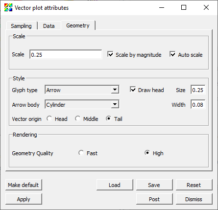
Fig. 4.113 The Vector plot attributes.
Click Apply and Dismiss.
Go to Operators->Slicing->Slice.
Open the Slice operator attributes window.
Set Normal to Arbitrary and to “0 1 0”.
Set Origin to Intercept and to “3”.
Uncheck Project to 2D.
Click Make default, Apply and Dismiss.
Click Draw.
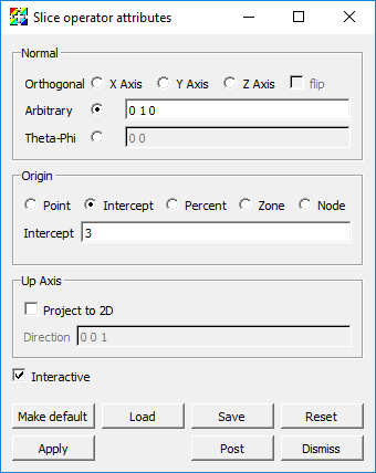
Fig. 4.114 The Slice operator attributes.
In order to give some context to the Vector plot of velocity on the slice let’s add a Pseudocolor plot of velocity_magnitude on the same slice and a Mesh plot.
Go to Add->Pseudocolor->velocity_magnitude.
Open the Pseudocolor plot attributes window.
Set Limits to Use Current Plot.
Click Apply and Dismiss.
Go to Operators->Slicing->Slice.
Click Draw.
Go to Add->Mesh->Mesh.
Open the Mesh plot attributes window.
Set Mesh color to Custom and select a medium grey color.
Click Apply and Dismiss.
Click Draw.
Zoom in to explore the plot results.
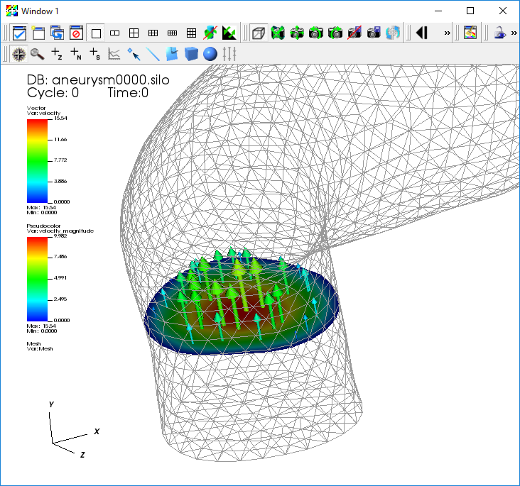
Fig. 4.115 The velocity on the slice.
The Vector plot uses glyphs to draw portions of the instantaneous vector field. The arrows are colored according to the speed at each point (the magnitude of the velocity vector). Next we create an expression to evaluate the vectors normal to the Slice. These normals should all point in the Y direction.
4.6.2. Creating a vector expression and using the DeferExpression operator
We will use VisIt’s pre-defined expression to evaluate the normals on a cell-by-cell basis.
Go to Controls->Expressions.
Click New.
Change the Name to “normals” and the Type to Vector mesh variable.
Go to Insert function->Miscellaneous->cell_surface_normal in the Standard editor tab.
Go to Insert variable->Meshes->Mesh in the Standard editor tab.
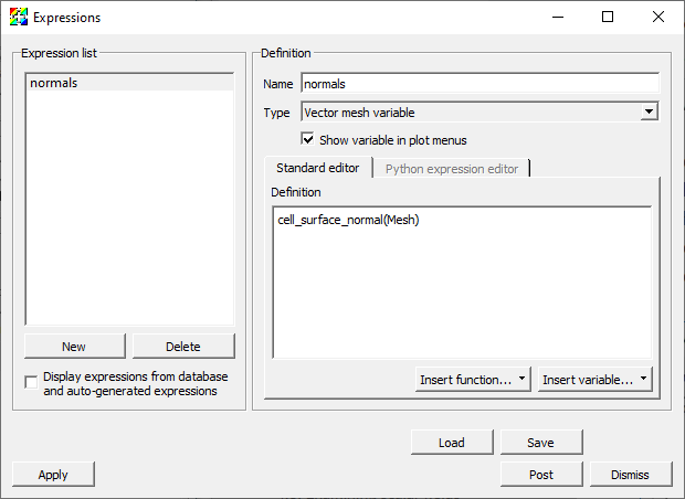
Fig. 4.116 The Expressions window.
Click Apply and Dismiss.
Return to the Vector plot and change its variable to “normals”.
You will then get the error message saying: The ‘normals’ expression failed because The Surface normal expression can only be calculated on surfaces. Use the ExternalSurface operator to generate the external surface of this object. You must also use the DeferExpression operator to defer the evaluation of this expression until after the external surface operator. In fact, VisIt cannot use the name Mesh which refers to the original 3D mesh. It needs to defer the evaluation until after the Slice operator is applied. Thus, we need to add the Defer Expression operator.
Go to Operators->Analysis->DeferExpression.
Open the DeferExpression operator attributes window.
Go to Variables->Vectors->normals.
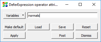
Fig. 4.117 The DeferExpression window.
Click Apply and Dismiss.
Click Draw.
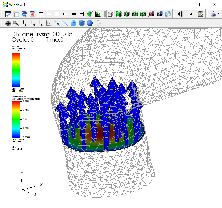
Fig. 4.118 The Vector plot of the normals.
Verify that all your normals point in the up (Y) direction.
4.6.3. Calculating the flux on the slice
We are now ready for the final draw.
Go to Add->Pseudocolor->operators->Flux->Mesh.
Go to Operators->Slicing->Slice.
Open the Slice operator attributes window.
Verify that the default values previously saved are used.
Move the Slice operator above the Flux operator.
Go to Operators->Analysis->DeferExpression.
Move the DeferExpression operator above the Flux operator just below the Slice operator.
Open the Flux operator attributes window.
Set the Flow field to “velocity”.
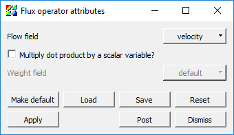
Fig. 4.119 The Flux operator attributes window.
Click Apply and Dismiss.
Click Draw.
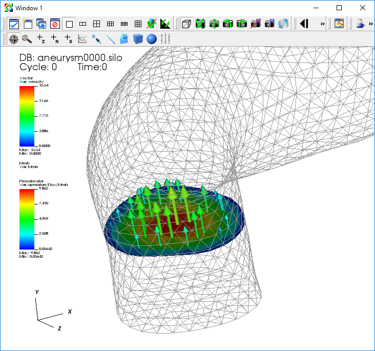
Fig. 4.120 The Vector plot of the flux.
Verify that you have a display that is cell-centered, and that will vary with the Time slider
Get the numerical value of the flux by query-ing for the Weighted Variable Sum.
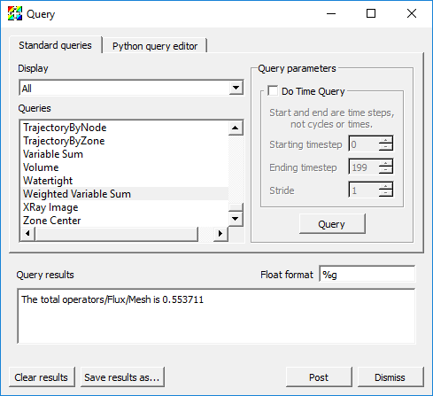
Fig. 4.121 The result of the Weighted Variable Sum query.